
Wheat fell 29%. The signal was in public data by April.
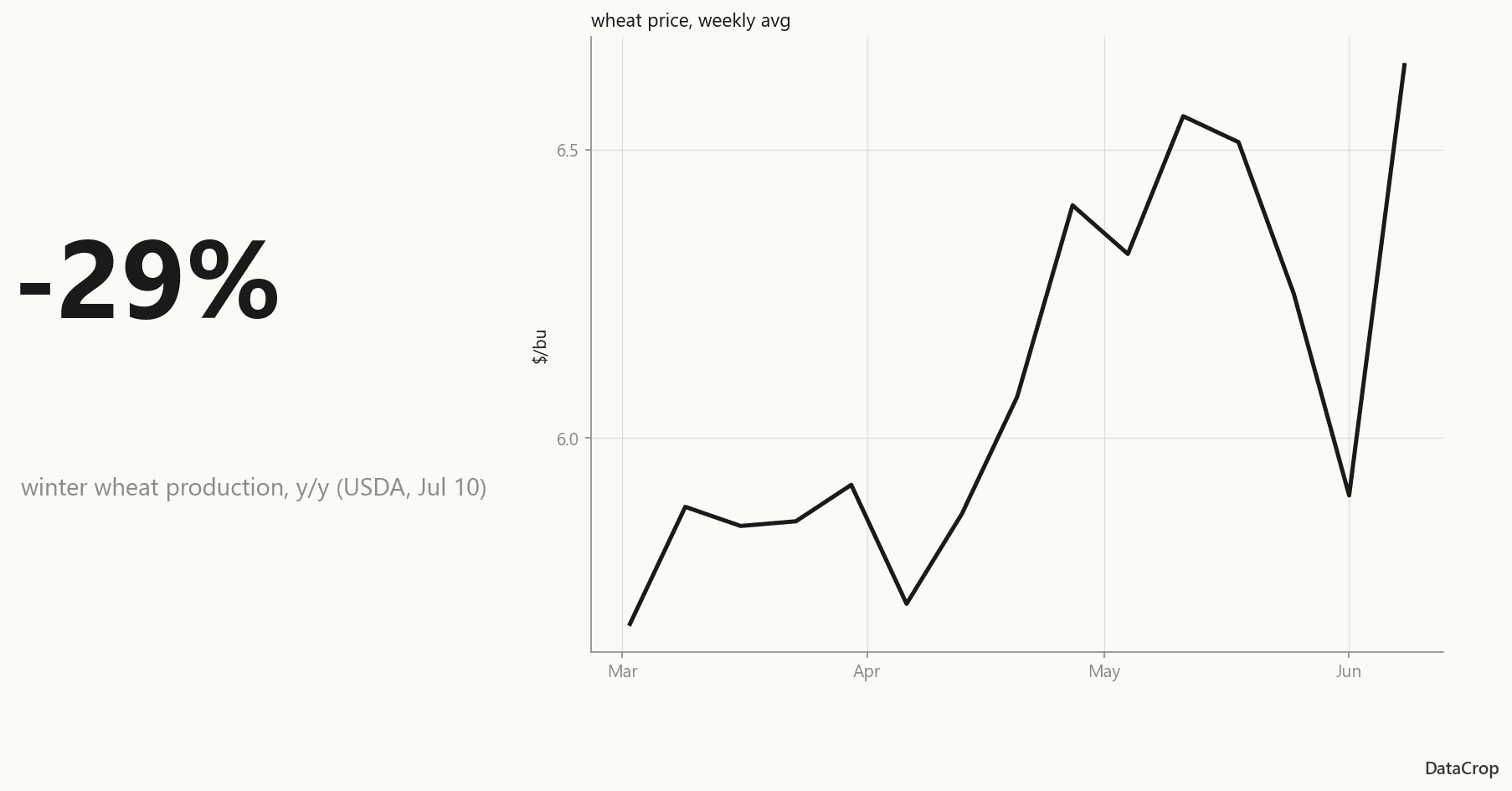
On July 10, USDA confirmed winter wheat production fell 29% year over year - the kind of move that torches a food manufacturer's margin plan. The signal was in the public data by spring.
Correction (August 6, 2026): This post originally ran under the headline "Wheat fell 29% and nobody saw it coming. A 13-week forecast did." That second sentence claimed more than the model delivers: on our published model metadata, the wheat point forecast scores 5.1% worse than a naive last-price baseline (train-time holdout, MAE). The model did not call this move, and the headline now says only what the data supports. The public-data timeline below is unchanged, and the section "What the model did not do" carries the numbers.
On July 10, USDA's WASDE report confirmed what wheat buyers had been feeling in their invoices for months: winter wheat production fell to 990 million bushels - down 29% year over year - and the projected farm price climbed $0.94 to $6.00 per bushel.
If you buy flour, that's not a statistic. That's your margin plan on fire.
Here's the uncomfortable part: the signal was in the public data by spring.
What the data showed, month by month
The decline didn't arrive on July 10. It assembled itself in plain sight:
- April: Drought conditions across the southern Plains were already degrading crop-condition ratings. Planted-area numbers from USDA's March intentions report were down.
- May: The first WASDE with 2026/27 projections put winter wheat production well below trend. Regional AMS bids started firming.
- June: Condition ratings kept sliding. The June WASDE trimmed production again.
- July 10: The 'historic decline' headline - and a $6.00 farm price that buyers who waited are now paying.
Each of those data points is free and public. The problem was never access. It's that turning FRED series, NASS QuickStats, and AMS bid reports into a forward view is a part-time job - one to four hours a week that most procurement teams don't have.
What the model's inputs were already showing
An honest disclosure before this section: we haven't yet exported our April model snapshots into a publishable audit trail, so you won't see an 'our April forecast' chart here. (Building that public audit trail is exactly what our WASDE Watch series is for.)
What we can show is what the model's inputs - all public - looked like in April: the crop-condition series in its feature set were degrading week over week across the southern Plains, March planted-area intentions were already down, and the AMS regional bid series were firming. That combination is the textbook shape of a drought year, and degrading inputs of that kind do widen a quantile model's upper band - though whether that widening arrives usefully early is a separate question, and one we later tested and could not answer in our favour. We're deliberately not claiming a specific April number we can't yet show you - when the audit trail ships, you'll be able to check every historical call yourself.
We won't pretend the model called the exact print. Quantile forecasts don't work that way - and any vendor showing you a perfect historical call is showing you the one chart that worked. What a band gives you is a range to plan against rather than a number to be wrong about. (An earlier version of this line claimed the band gives you *early* warning - the asymmetry arriving before the move. We tested that and it did not hold; see the correction further down.)
The buyer math
Say you buy 100,000 bushels a quarter. A buyer who locked at April spot prices versus one who bought through the spring rally paid on the order of tens of thousands of dollars less for the same wheat - the difference between reading a forward band and reading last month's invoice. Run your own volume through the July numbers ($6.00 projected farm price, up $0.94 year over year) and the arithmetic gets uncomfortable fast.
How to read a band like a buyer
A quantile forecast has three lines:
- p50 (likely): the middle of the distribution - your budgeting number
- p10 (best case for buyers): prices only fall below this 1 time in 10
- p90 (worst case): prices only exceed this 1 time in 10
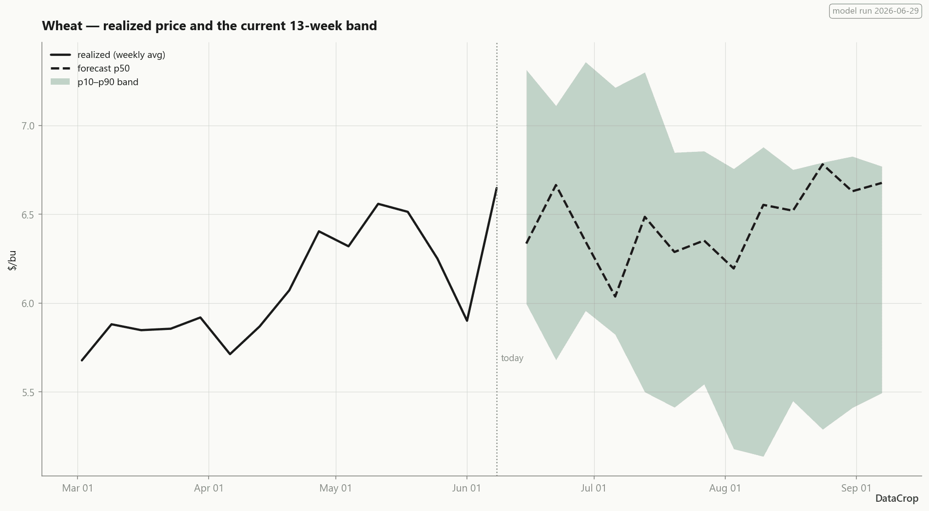
When the p90 edge starts pulling away from p50, the model is telling you upside risk is building - that's a lock signal, even when the p50 looks calm. That pattern is exactly what drought years produce.
What the model did not do
Honesty section, because it's the whole brand: our point forecast does not beat a naive 'last price' baseline right now - at 1-week horizons it's roughly on par, and across the trained curve the naive baseline is hard to beat on raw MAE. We show that skill-vs-naive number in your dashboard, in red, whenever it's negative. What the forecast adds isn't a sharper point estimate - it's the shape of the band: when the model is less certain, the band widens.
A second correction, August 8, 2026, and this one is about the sentence that used to follow. This post claimed that widening was "the buy-timing signal" - that the band's upper edge moving before the median tells you when to act. We tested that claim deliberately and it failed. In August 2026 we pre-registered a volatility experiment: the bar was a mean MAE improvement of at least 10% over a persistence baseline on at least 6 of 11 commodities, written down and committed *before* the experiment script existed so the bar could not move afterwards. It cleared 4 of 12 at four weeks and 4 of 12 at thirteen. It missed at every horizon.
So the honest version: when the model is less certain, the band widens. We have not shown that the widening anticipates volatility any better than assuming next month looks like last month - we went looking for exactly that, with the bar fixed in advance, and did not find it. A claim whose disconfirming experiment sits in our own repository is worse than one we never tested, which is why this correction is here rather than quietly edited away.
One further update since this post ran: in August 2026 the published forecast was cut from thirteen weeks to at most three. The reason is not that the calibration held to week three and failed after — measured against the 80% target it was under at every horizon, including all three we serve, and worst at the long end. The reason for the cap is comparative: past three weeks our band is beaten by one you can build yourself from recent price moves, using the history we publish for free. We would rather serve less than serve something a reader can beat with arithmetic. The model still trains thirteen horizons; the API returns up to three.
Watch the next one build
The grain forecasts rerun every Monday; the bands are in the dashboard on Pro plans and up. The free weekly email digest is in final testing — subscribe with just an email address and you're on the list for the first send. If this April had a Monday band in it, would your Q3 flour costs look different?