
We publish our misses. Here's how honest our grain forecast really is.
Most forecast tools show you the one chart that worked. We show the scoreboard - including the week we measured our own band against a homemade one and lost. What we publish instead of an accuracy claim, and why the baseline ships inside every response.
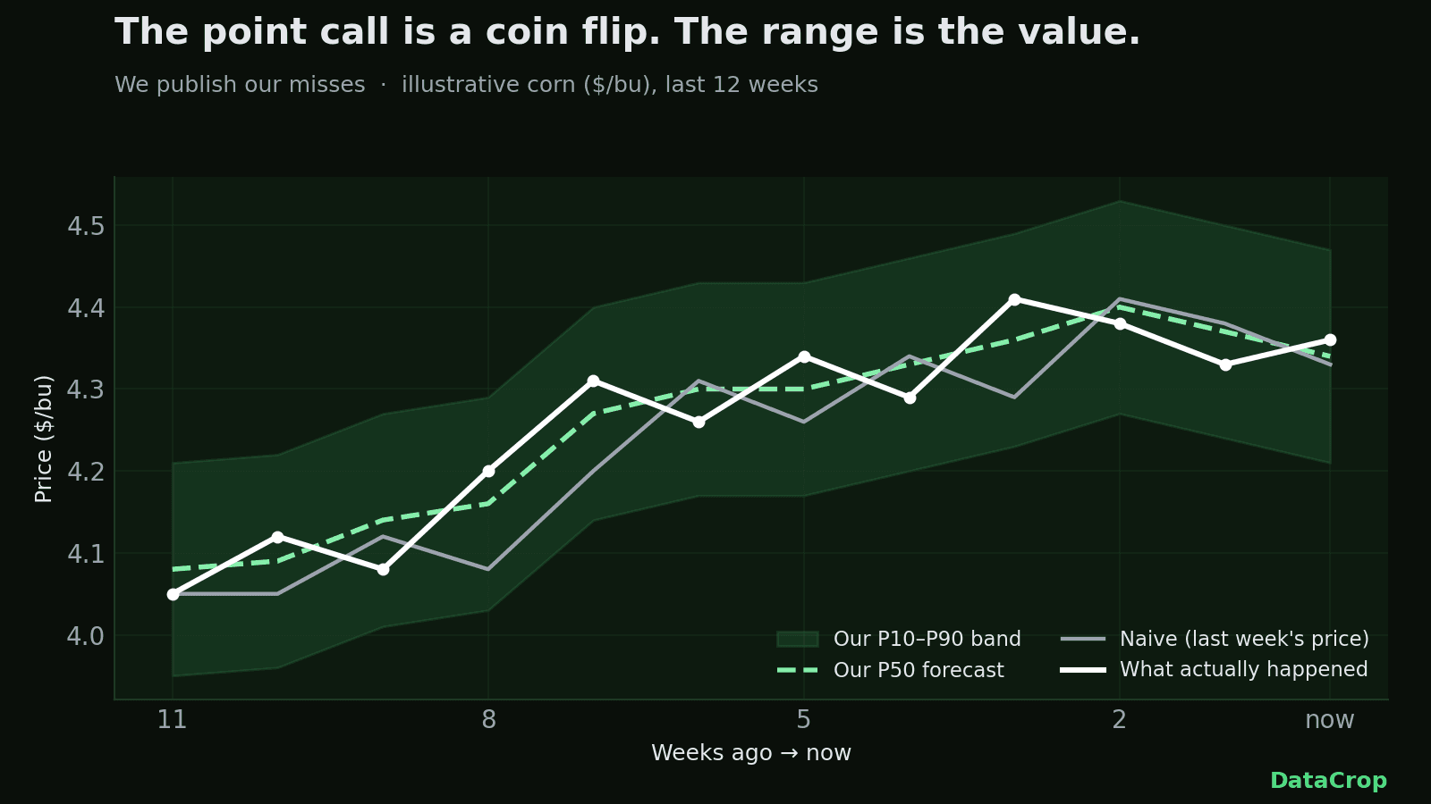
Correction (August 8, 2026) — this one is about our own argument. This post originally ran on the pivot "the point call is a coin flip, but the range is where the value is." We since measured the range, and it does not carry that weight either: our band loses to an empirical band you can build yourself from trailing price moves on 133 of 143 commodity-horizons we scored, and measured coverage of the bands we published sits well under the 80% we were calibrating toward. The second half of this piece has been rewritten rather than patched, because fixing one sentence would have left the thesis standing and implied the rest had been checked. The chart at the top still carries the old headline — it predates this correction and we have not re-rendered it. What survives, and what the rewrite argues, is below.
Correction to the correction (August 12, 2026). The number directly above — the homemade band winning 133 of 143 commodity-horizons — is itself wrong, and wrong in our own favour to have published. The naive baseline it was benchmarked against was reading post-origin prices at every horizon of two weeks or more, a lookahead bug in our own benchmark script. Corrected, the comparison is 100–43 in our favour raw, and 71–72 — a dead heat — once both bands are calibrated the same way, not the loss stated above. The h=1 leg, the only one structurally immune to the leak, was and is unchanged. We are leaving the retracted figure above rather than editing it out, consistent with how we handled the first correction; the finding is recorded in docs/handoffs/w10/_dod-audit.md.
Every commodity-forecast tool on the internet will tell you it's accurate. Some will put a number on it — "5x more accurate," "industry-leading." Here's the thing none of them show you: the weeks they got it wrong.
We're going to do the opposite. This is our scoreboard.
The point call is a coin flip
Look at the chart at the top of this page. It plots three things over the last several weeks: our P50 forecast (the median — the "likely" number), a naive baseline (literally last week's price), and what corn actually did.
Notice how tangled they are. That's not a rendering accident. On the raw point number — "what will corn cost a few weeks out" — our model is roughly parity with that naive baseline, and near-in it is behind: at one week out it scores worse than simply carrying today's price forward.
Being precise about that, because the sweeping version would also be wrong: skill is measured per commodity and per horizon, not as one verdict about "the model". It varies, in both directions — and "we never beat the baseline" is as inaccurate as claiming we always do.
Here is the part that is genuinely awkward for us, so you should have it. Corn does beat the naive baseline at some horizons — but every one of those wins sits at six weeks out or beyond. The band we publish stops at three. So inside the window you actually receive, corn, wheat and soybean beat the baseline at zero horizons, and that is why we publish no directional call on the free grains at all. The p50 you see is the middle of the band, not a prediction.
You do not have to take that on trust: every response carries point_published, which is false on every row we serve for those three, and naive_baseline, the carry-forward series we are being measured against.
And the obvious follow-up — *then why not extend the band to six weeks and keep the wins?* The original answer here said the band gets beaten on width past three weeks by a baseline you can build yourself; that is the measurement corrected above to a dead heat, so it no longer carries the argument. What survives is the decision: those wins are point-skill readings at horizons whose band we have never validated end to end, and having corrected one benchmark in our own favour already, we are not going to extend the product on the strength of it. The cap stays at three weeks as a product decision while the corrected comparison is re-evaluated.
We could hide that. Most vendors do. Instead we'll say it plainly: if the pitch is "our AI predicts the price," be skeptical — of them and of us. Weekly agricultural prices behave a lot like a random walk plus the occasional weather or policy shock. There isn't a hidden, learnable edge that turns next quarter's corn price into a number you can bank. Anyone showing you a flawless historical call is showing you the one chart that worked.
So why does the forecast exist at all?
The range doesn't rescue it either
This is where the original version of this post pivoted. It said: the point is a coin flip, but the *shape of the uncertainty* is something we can calibrate honestly, so the band is the product. We then went and measured the band, and that pivot does not survive contact with the result.
Instead of one guessable point, you do get three numbers: P10, P50, P90. A band.
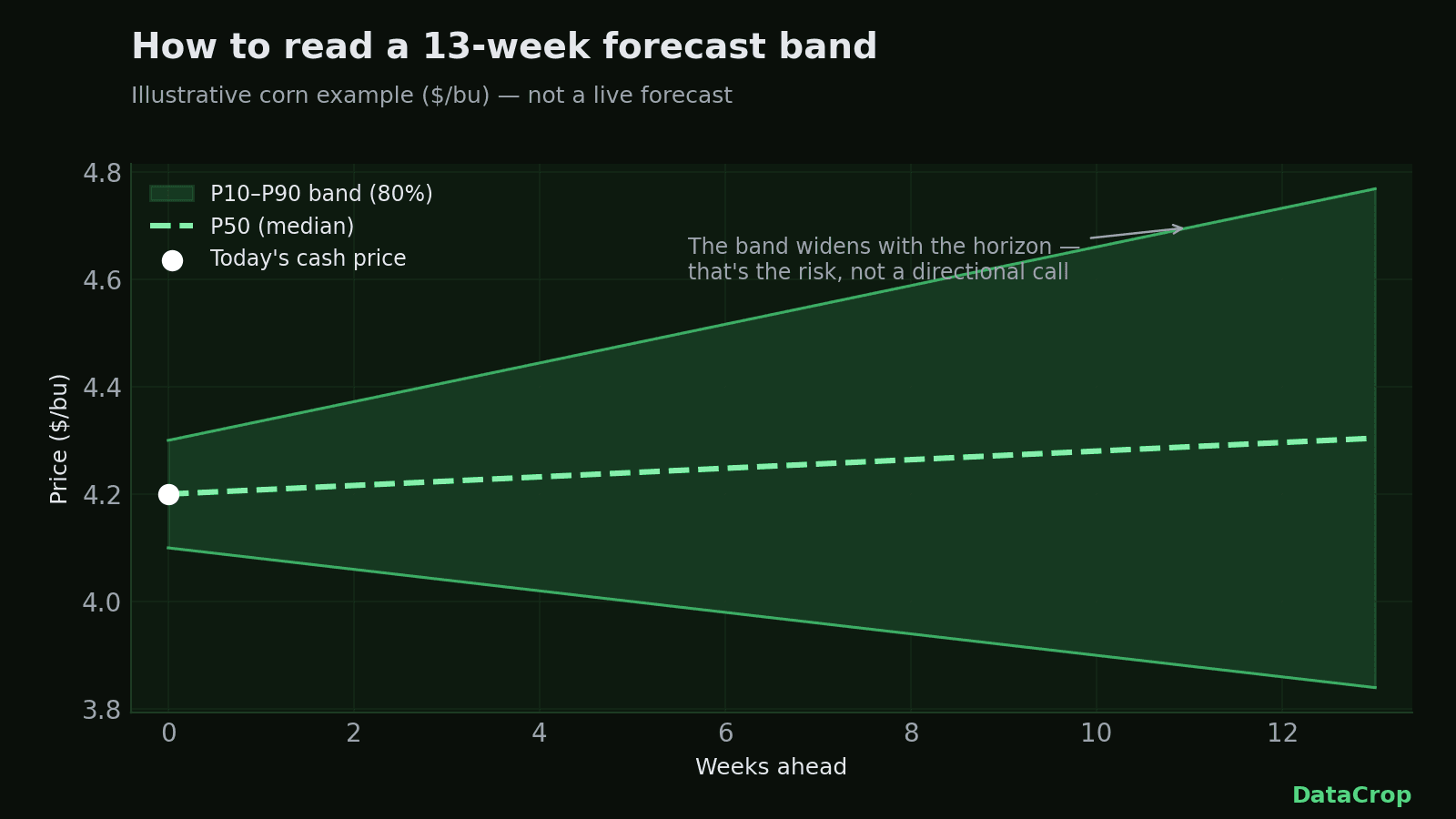
Here is what measuring it produced. Take the same price history we publish for free, compute the trailing distribution of weekly moves, and draw a band from those quantiles. That is arithmetic on public data — no model, no training, nothing you'd pay for. Scored across the 143 commodity-horizons we measure, it is 100–43 in our favour raw, and 71–72 — a dead heat — once both bands are calibrated the same way, which is the comparison that matches what we ship. At one week out, the horizon nothing can leak into, the two have always been a dead heat.
And the label was optimistic. We calibrate toward 80% coverage, meaning roughly four of every five actual prices ought to land inside the band. Measured against the bands we actually published, coverage sits well below that. We are not going to put a percentage on it here, because the honest sample is still tiny: of the settled weeks we can score so far at one week out (h=1), corn landed inside 1 of 3, wheat 2 of 3, soybean 1 of 3. Three weeks is not a coverage rate, it is three settled weeks at a single horizon, and a percentage computed from it would be theatre.
So: the point call doesn't beat a naive baseline inside the window we serve, and the band doesn't beat a baseline you could build yourself. If you came here for a number that beats free, we don't have one, and the scoreboard is why you can tell.
What we'd actually defend
The pitch, then, is not the artifact. It's the discipline — and every part of it is something you can check rather than something we assert.
- We ship the baseline we're judged against, inside the response. Every forecast row carries
naive_baseline, the carry-forward series, andskill_vs_naive, the score against it. You do not have to trust our summary of how we're doing; you get the comparison as data, on every call. We have not found another vendor who hands you the stick you'd beat them with. - We withhold the point where it loses, automatically and per horizon.
point_publishedis false on every row we serve for corn, wheat and soybean, so the P50 renders as a band median rather than a call. That is a gate in the code, not a promise in a blog post. - We capped the band at three weeks because we measured it, and kept the cap when the measurement changed. The response says so itself, in a field: *"We capped it because we measured it, not because 3 is a round number."* The benchmark behind the cap is the one corrected above — the cap now stands as a product decision while that corrected comparison is re-evaluated, and shipping less until the evidence settles is the only version of this that means anything.
- We publish misses with denominators, and refuse a rate the sample won't support. 1 of 3 is a fact. "33% coverage" would be a number dressed up as a finding.
That is a smaller claim than the one this post used to make. It is also the only one that survived being measured.
How a buyer actually uses this
You don't trade the P50 — and on the free grains we don't publish it as a call anyway. You bracket your exposure with the range, knowing what the range is and isn't.
Drop the P10 and P90 into your break-even math and see which end still clears your margin. If even the P90 keeps you whole, you have room to wait. If the P90 blows through your number and the band is widening, that's worth acting on. What has changed is the framing around it: treat the band as a scenario bracket for planning, not as a calibrated probability statement, because we have not yet earned the second one. If you want a probability you can lean on, build the empirical band from the history we give you — measured head-to-head after the correction it is a dead heat with ours once both are calibrated, and it costs you nothing, which we would rather tell you than have you discover.
What we won't pretend
A few things we're deliberately not going to claim:
- We don't forecast everything. The forecast covers grains — corn, soybeans, wheat. The clean USDA + FRED data and the API cover the rest of the commodity complex, but there's no forecast on hogs or cocoa, and we're not going to imply there is.
- We don't beat the desk. If you run a serious trading operation, our forecast is not alpha. It's an honest second-opinion range built on public data, priced so you don't need a Bloomberg seat to see it.
- We don't lock you in. The whole thing runs on free, public data. You can export what you pull. Two ag-data platforms that sold opaque, enterprise-only "intelligence" — Gro Intelligence and AgFlow — shut down in the last couple of years and stranded their customers. Cheap, transparent, and portable is a feature, not a compromise.
Why publish the misses at all
Because trust is the only moat a small, honest tool has. The market is full of buyers and traders who've been pitched by every forecasting startup and found none of them worth the invoice. The fastest way to earn that room's attention isn't a bigger accuracy claim. It's being the one vendor that shows the weeks it was wrong — and keeps showing up the next Monday anyway.
So that's the deal. Every week, a fresh band for corn, soybeans, and wheat, with the baseline it's scored against shipped alongside it. When the band is too tight and the actual lands outside, that goes on the scoreboard — as a count, with its denominator, however small and however bad it looks. This correction is that policy applied to our own argument.
Hold us to it
The grain forecast reruns every Monday, and the bands are in the dashboard on Pro plans and up. The free weekly email digest is in final testing — subscribe with just an email address, no credit card, no account, and you're on the list for the first send.
If you'd rather judge the forecasts yourself before you trust a word of this: that's exactly the point. Watch the bands for a month, read skill_vs_naive off the responses, and hold us to the counts.